Thursday 29 January 2015

Market Research


My Target Audience:

One of the most difficult things in terms of research for my magazine has been finding evidence of a target audience.
There is little currently existing content of the same genre due to it's fairly niche but growing listener base, so it is difficult to pinpoint a target audience. However, the time period on which the music is inspired as well as the modern nature of it suggest dual audience age ranges.
This music genre 'Synthwave' is heavily inspired by the electronic music of the 1980's while bearing a modern twist. See more on the genre itself on my 'choice of music genre' post.

Firstly, I think that this genre is better suited to a male audience. It's iconography is fast cars, vice, sci-fi, and so on. This is definitely a more male oriented genre of music along with the patriarchal values of the 1980's which I think acts as ironic / nostalgic homage to that era.

Furthermore, given that the younger and teenage generation of the 1980's would now be in their 30's and 40's, a magazine of this genre should appeal to the nostalgic and familiar values of that generation. All while at the same time appealing to and introducing the 80's aesthetic to the teenagers of the 2000's and 2010's.

Finally, given that more young people spend time on the internet, play video games, and listen to electronic music now than ever before, I think that the genre should focus more on introducing the newer generations to the 80's electronic genre than appealing to adults who perhaps a very small, niche group of whom listened to similar music during the 80's and early 90's.

In Conclusion, I would estimate from this that the target audience for my magazine and the genre overall must be a range from a predominantly male pre-adolescent, teenage, 20's and possibly early 30's listener base. However there is nothing to exclude women from the genre, although in theory female listener base should be significantly smaller than that of the average male, especially electronic music fans or those born in the 1970's and 1980's.

Examples of the genre in pre-existing magazines: Simply put, there are no existing magazines designated to this and the only sources of inspiration for the magazine is the YouTube Channel 'New Retro Wave' and 1980's Artwork, Magazine Covers and images based on this genre or that the genre itself is based on, taken from the Internet; much like the content above. Finally, one of the most important methods of understanding the aesthetic of the genre is to just listen to Synthwave and look at imagery like that shown on the 'Choice of Music Genre' post to create an image of what the magazine should look like while incorporating the necessities of a magazine cover onto that image conjured in my head.


My Choice of Music Genre


Of all the typical genres out there, none really interested me to create a magazine cover that I felt could be both original, eye catching, and that I would enjoy creating and experimenting with.

I dislike Rap Music, R&B, Country Music and pretty much anything in the Charts so those were out of the question.

Pop and Modern Rock music were a consideration, although I didn't feel confident in being able to pull off a magazine cover to a professional standard as I know little about current rock music beyond bands like the Foo Fighters and I know next to nothing about pop music.

I decided that I should do something revolving around Electronic Music since that would suit my musical tastes and thus I would have a better knowledge of what to use for research and inspiration  because I know more sub-genres of Electronic Music such as Disco, House, Dubstep, EDM, as well as Electronic Artists like Giorgio Moroder, Daft Punk, Savant, Madeon, and other less heard of Artists.

However, I wasn't entirely clued up on fashion or culture relating to Electronic Music so I decided to go for something obvious that was easy to copy the Imagery, Iconogrpahy, and Mise-en-Scene associated with it.

I chose 'SynthWave'.

Also known as 'Retrowave' and 'Dreamwave' This is a postfuturistic, nostalgic take on the Electronic Synth and Wave music of the 1980s born from the growing popularity of computer-made music and the wild experimentation taken with them at the time. The genre also takes a great deal of inspiration from Video-Nasties / Action Movies and their hard hitting, cold, unearthly sounding Soundtracks  dating back to  somewhere around the late 1970s to late 1980s

Believed to have been originally formed in the late 2000s, gaining popularity in 2010, notably with the 2010 album 'Redline' by 'Lazerhawk' and many other Internet-Based Albums and EPs by amateur artists such as Mega Drive, Power Glove, Tommy Chase, Trevor Something, . The genre was finally used by a professional artist in 2013 with DJ Kavinsky's album 'Outrun'.

The genre is heavily associated with:

  • Neon lights,
  • Science fiction (eg. Blade Runner, Tron, Star Wars etc.)
  • Most forms of media, (namely Movies and Video Games)
  • Primitive Computer Vector Graphics such as those seen in vintage Video Game Systems such as the Vectrex,
  • Crime Drama, (eg. Scarface, Golgo 13, Batman etc.)
  • Fantasy Media such as Dungeons & Dragons, Conan the Barbarian, Labrynth and so on


sci fi


Friday 23 January 2015

How to achieve A*/A/B

1. Be Critical - rework the designs, retake photos, use photo manipulation.


2. show your development of your work. Accompany screenshot images with comments


3. Frequent Posts! - Sometimes short + snappy is better than an extended essay.


4. Use a broad range of media. Eg:

  • Prezi
  • Goanimate
  • Slideshare
  • Youtube
  • Mobile video interviews + production shots

Music Genre Images


R&B


Rock music


 Electronic Music


Tuesday 20 January 2015

Progress Images

The font for the masthead:

The first thing I did for the magazine cover was to select what I thought was a fitting font for the masthead, as this would give me a fair sense of guidance for the rest of the cover in terms of themes and styling. I used the font 'Levi Brush' from dafont.com (http://www.dafont.com/levibrush.font)


Early Imagery Testing:

When I first obtained the font as an image, I made it transparent by using the colour select tool and removing all white shades. My original intention was for the magazine to feature a photo of the Deep aquarium as the background, so I found an existing image online and put my font over the image, partially for testing to see if the masking had worked correctly but also to get a feel for the image in general. The image was in black and white to better help my identify white spots on the font but I was also considering having the cover be in B&W. I decided that I didn't like the theme and went with the retro sci-fi computer vector graphics imagery instead.


The Main Image:

I chose this image to be my focus for the magazine cover. Im the image he wasn't entirely symmetrical due to the framing and angle at which I took the photo as well as the way that my model had posed, so I skewed the image slightly until it looked what I considered to be evenly spaced and his shoulders were at approximately the same height.


Creating the vector Graphics

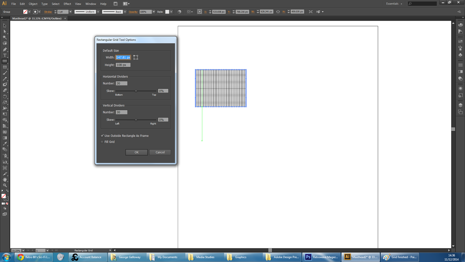
By watching the following YouTube tutorial: https://www.youtube.com/watch?v=6K-8ZqBUjBg
I started by creating a grid which I thought was of the appropriate aspect ratio and simply copy + pasted it into Photoshop where I then skewed the image to form the base of the vector grid.


Seen Here: Applying some red paint tool to cover over some of the remaining green blotches left in his hair. (Middle / Top of Image)


Masking and Colours

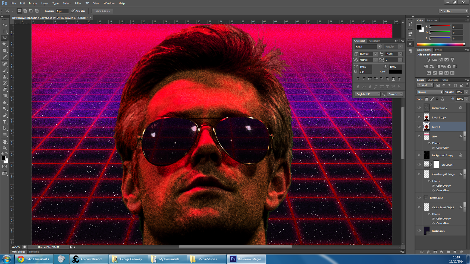
Making use of the green screen in the image and implementing the vector grid with a heavy skew on it, duplicated and clipped to create a horizon affect, (similar to old video games which try to use vector graphics to simulate 3D orientation). I added a dark blue coloured background and the colour base for the cover was set.


Gradient (Part 1)

I added a glow effect to the grids, changed the colour of the top one to purple and added the base gradients as separate layers, which would later receive glow effects to make the intersection more difficult to distinguish as well as making it look more like a bright light source with diffraction spikes.


Gradient (Part 2)

After much trouble, I gave up on the vertical diffraction spike and created a more interested horizontal gradient with a much of both a pink blow and a purple flaring glow. I think that this looks nicer this way anyway. It's possible that the vertical spike looked fine and I was just being biased as I didn't like it.


Noise: Film Grain / Stars

I added a layer of pure noise to emulate print grain on all of the layers shown and a couple included later such as the mountain background.

Furthermore, I added another layer of noise with different properties just above the background layer to create the effect of stars.


Showing the background through the sunglasses:

To achieve this, I duplicated the layer of Ben, made the lower layer partially transparent, then cut his sunglasses out entirely, revealing transparent layer which was positioned exactly the same as the layer above. This meant that the transparent sunglasses revealed the background behind him and also made it difficult to see where the forefront layer had been cut.

I was able to cut them out with a fairly low level of precision needed, as it was difficult to see on the dark sunglasses and through the film grain / noise.


Applying magazine elements:

I copied the masthead over, removed the background through the use of colour select, softened it to reduce hard edges and pixellation. Then I applied a gradient to it's layer in order to achieve a hot Sci-Fi chrome look to it  based off of such images as this.
chrome-20

and  


More examples can be found here and here

(Personally, I think that my font doesn't look right and lacks some sort of shiny edge or solid duplicate mask shadow. The gradient is also not quite right thought I can't put my finger on how or why.