
The font for the masthead:
The first thing I did for the magazine cover was to select what I thought was a fitting font for the masthead, as this would give me a fair sense of guidance for the rest of the cover in terms of themes and styling. I used the font 'Levi Brush' from dafont.com (http://www.dafont.com/levibrush.font)

Early Imagery Testing:
When I first obtained the font as an image, I made it transparent by using the colour select tool and removing all white shades. My original intention was for the magazine to feature a photo of the Deep aquarium as the background, so I found an existing image online and put my font over the image, partially for testing to see if the masking had worked correctly but also to get a feel for the image in general. The image was in black and white to better help my identify white spots on the font but I was also considering having the cover be in B&W. I decided that I didn't like the theme and went with the retro sci-fi computer vector graphics imagery instead.

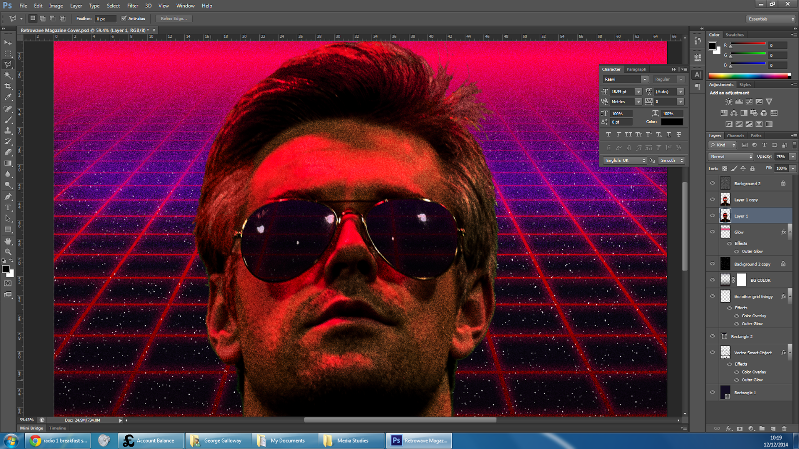
The Main Image:
I chose this image to be my focus for the magazine cover. Im the image he wasn't entirely symmetrical due to the framing and angle at which I took the photo as well as the way that my model had posed, so I skewed the image slightly until it looked what I considered to be evenly spaced and his shoulders were at approximately the same height.
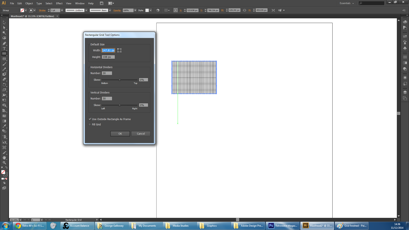
Creating the vector Graphics
By watching the following YouTube tutorial: https://www.youtube.com/watch?v=6K-8ZqBUjBg
I started by creating a grid which I thought was of the appropriate aspect ratio and simply copy + pasted it into Photoshop where I then skewed the image to form the base of the vector grid.


Seen Here: Applying some red paint tool to cover over some of the remaining green blotches left in his hair. (Middle / Top of Image)
Masking and Colours
Making use of the green screen in the image and implementing the vector grid with a heavy skew on it, duplicated and clipped to create a horizon affect, (similar to old video games which try to use vector graphics to simulate 3D orientation). I added a dark blue coloured background and the colour base for the cover was set.

Gradient (Part 1)
I added a glow effect to the grids, changed the colour of the top one to purple and added the base gradients as separate layers, which would later receive glow effects to make the intersection more difficult to distinguish as well as making it look more like a bright light source with diffraction spikes.
Gradient (Part 2)
After much trouble, I gave up on the vertical diffraction spike and created a more interested horizontal gradient with a much of both a pink blow and a purple flaring glow. I think that this looks nicer this way anyway. It's possible that the vertical spike looked fine and I was just being biased as I didn't like it.
Noise: Film Grain / Stars
I added a layer of pure noise to emulate print grain on all of the layers shown and a couple included later such as the mountain background.
Furthermore, I added another layer of noise with different properties just above the background layer to create the effect of stars.


and


Showing the background through the sunglasses:
To achieve this, I duplicated the layer of Ben, made the lower layer partially transparent, then cut his sunglasses out entirely, revealing transparent layer which was positioned exactly the same as the layer above. This meant that the transparent sunglasses revealed the background behind him and also made it difficult to see where the forefront layer had been cut.
I was able to cut them out with a fairly low level of precision needed, as it was difficult to see on the dark sunglasses and through the film grain / noise.
Applying magazine elements:
I copied the masthead over, removed the background through the use of colour select, softened it to reduce hard edges and pixellation. Then I applied a gradient to it's layer in order to achieve a hot Sci-Fi chrome look to it based off of such images as this.
and
(Personally, I think that my font doesn't look right and lacks some sort of shiny edge or solid duplicate mask shadow. The gradient is also not quite right thought I can't put my finger on how or why.
No comments:
Post a Comment